") Don't have an account yet?
Don't have an account yet? 
Forum Thread
Riako's June of Pixelart
Forum-Index → Fanmades → Spriting → Riako's June of Pixelart

Posted: Sun, 01/06/2025 12:00 (5 Days ago)
This June, I've set myself an exciting goal: to learn how to create pixel art. I'm doing this purely for fun and not with any intention of becoming a professional. After all, I'll most likely always be a coder at heart :)
My plan is to practice every single day throughout the month of June. One of my goals is to create my own PokeHeroes-style event Pokémon by the end of the month. However, I'll start with smaller and simpler projects to build my skills.
In this thread, I'll be sharing my daily progress and would love to hear your thoughts!
Any form of feedback, constructive criticism, or help is deeply appreciated! Please feel free to point out any mistakes you notice. I'm grateful to anyone willing to guide me on how to improve from my current skill level.
For my pixelart journey, I will be using Aseprite. I have some basic experience with it, but mastering this tool will be part of my learning process.
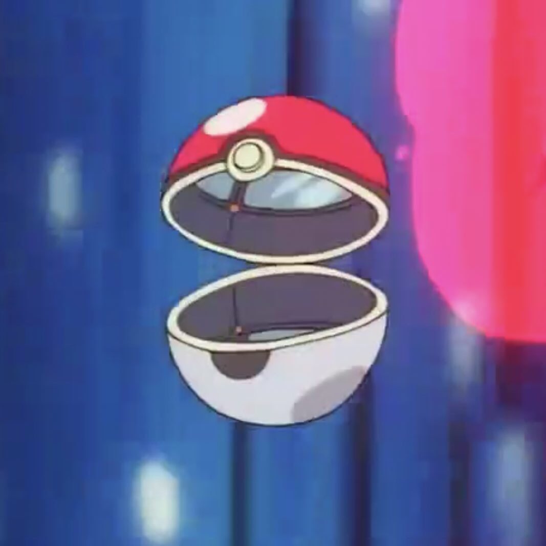
Day 1: A simple Poke Ball
Today, I spent most of my time (re-)installing Aseprite and watching a couple of tutorials on the basics of the software and pixel art. To ensure I documented some progress, I attempted to sprite a Poké Ball. I used a random non-pixel art reference photo of a Poké Ball from Google and started spriting. I chose the AAP-64 color palette because, well, I wasn't entirely sure what I was doing. I picked one that had a manageable number of colors, including darker and lighter versions for lighting accents and shadows.
Here is my result:
(Original size)
(8x scale)
Please let me know what I could improve and how. I feel like the shading doesn't quite make the ball look round, so any hints on improving that would be greatly appreciated.
Posted: Sun, 01/06/2025 13:22 (5 Days ago)
Also, Aseprite. I like that program a lot. It's got a ton of options for different color palettes for different systems and a very nice interface.

Posted: Sun, 01/06/2025 13:43 (5 Days ago)


Posted: Sun, 01/06/2025 13:48 (5 Days ago)
I'm really excited about your upcoming pixel art pieces! Can’t wait to see how they all turn out!! 👀✨
I'm not a professional pixel artist myself, but I’d love to offer a bit of advice based on what I’ve learned so far.
Let’s take a Poke Ball as an example. I would say one of the most important things when starting a piece is to first think about the basic shape of the object. In this case, a Poke Ball is a sphere.
First off, I started with a Poke Ball circle. There's no sphere here, it's completely flat.

(Original size)

(8x scale)
This is the point where I think "how would a sphere work?". If I want to capture that Poke Ball roundness, how do I do it? Well then I made a basic greyscale shading to understand how to turn my 2d into 3d.
Note: You don't have to do this as a part of the process (ideally you'd do it directly on the Poke Ball), I did it because I think it's easy to understand this way.

(Original size)

(8x scale)
Then I would just do the same with the Poke Ball. I suggest to just make a new layer on top of the base one, set on Multiply mode and lower the opacity to your liking. I tend to use purple tones when coloring shadows on Multiply. Then another layer on Overlay using a yellow/orange tone for the lights usually works just fine! (It depends, though. You might need to play with the tones a bit)

(Original size)

(8x scale)
And in the last step, I would just add extra lights and shadows for more contrast & realism (the specular light makes it even more sphere-like!), or color the lineart using darker tones, but all of this depends on what kind of render you want for it. This is not a necessary step though, it's up to you! c:

(Original size)

(8x scale)
On a side note: For the shadows on the white area, I usually stick to greyish blue/purple tones, they tend to work really well. That way it doesn't lose whiteness c:
I hope this helps, and have fun! 🦐


Posted: Sun, 01/06/2025 14:10 (5 Days ago)
but adding onto what Politoed said:
if you make your darks/shadows slightly colder (blues + purples) and lights/highlights slighty warmer (reds + yellows) then it brings out a little more colour and gets you more contrast for your buck.
eg, you can have something be #FFFFFF in the mid-tone and then #FFF8DD in the light, even though that's technically darker; or you can have a #000000 block with a #030033 or something in the dark, even though that's technically lighter.
 <- this has a main colour of pure white
outlined by pure black, but you can kinda tell that it's 3d from
the cold bottom-left and warm top-right (#000033/#d0c0f0 in the
shade and #665555/#fff8dd in the light)
<- this has a main colour of pure white
outlined by pure black, but you can kinda tell that it's 3d from
the cold bottom-left and warm top-right (#000033/#d0c0f0 in the
shade and #665555/#fff8dd in the light)scaled-up:

also worth looking into anti-aliasing if you fancy. lots of programs do that automatically but i haven't used aseprite so idk.
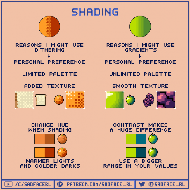
more info on hue-shifting here and an infographic on color-shading:


Posted: Sun, 01/06/2025 14:21 (5 Days ago)
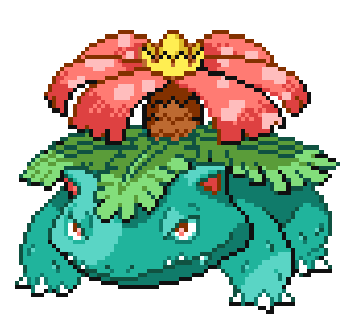
you can see that the outlines on the upper half of body parts (like the most top-side outlines of the petals, or the leaves and the skin) are not pure black, they are a darker shade of the leaf/petal/skin in all places, where the lightsource hits the "object" (aka Venusaur).
This makes your sprites look more organic :)
In case of


Posted: Sun, 01/06/2025 14:50 (5 Days ago)
referencing the bulbapedia images of pokeballs might help

Posted: Sun, 01/06/2025 16:30 (5 Days ago)
A sphere's shadow is curved, so even though the colours are split, treat it as one shape, just change the colour accordingly. Don't cut the shadow up, or else your eyes will struggle to comprehend how the lighting works. Only cut them up if it's not flat, where one protrudes or sinks in more than the other. Even then, the shadow will be warped and still maintain its general shape.
Moreover, if we consider material, a pokeball is likely around plastic/metal material and shines so that where the light concentrates the more, have a speck of white to show reflection and shininess.
Finally, a pokeball centre, the tiny white part is protruding and thus will have its own little shadow!
Otherwise, for a first attempt it's really good and I can't wait to see more :D

Posted: Sun, 01/06/2025 18:54 (5 Days ago)


I just added more tones to it.

Posted: Sun, 01/06/2025 21:35 (5 Days ago)
Considering how light sources reflect on round objects as well as using cooler/lighter colors for shading/highlights were already mentioned, so I'll mention a couple other things I thought about:
- Round pixel objects generally do better with an odd amount of pixels per side, especially if they contain smaller round objects like a Pokeball does. In your case a slightly smaller 15x15px diameter could make it appear more round.
- The part where the Pokeball opens is rather thick when you're using an even amount of pixels per side and want it to be in the middle between both halves. A solution to that could be making it thinner and slightly curved, which also would help it appear more round perspective-wise.
I don't have my laptop with me, so I tried whipping up an example with my phone using Pixel Studio, to help visualize:

(original size - 15x15px)

(scaled x8)

Posted: Mon, 02/06/2025 05:02 (5 Days ago)

Posted: Mon, 02/06/2025 06:24 (5 Days ago)
Posted: Mon, 02/06/2025 18:55 (4 Days ago)
Day 2: Improving the lighting
So today I tried to implement various of your suggestions into my Pokeball design. Politoed's suggestion of separating the 3D shape from the texture of the object helped me a lot. And instead of just copying what Politoed provided to me, I tried to visualise the 3D shading of a ball myself - with my recently acquired skill in Blender!
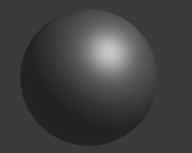
I used this render next to my Pixelart Pokeball to see where light and where shadow should go. Here is today's progress:
(Original size)
(8x scale)
The first one is still yesterday's result. I then did three iterations:
First I noticed that the inner circle of my Pokeball was perhaps too small, so I greatly increased its size. ... By too much, as I later noticed! (Hence why it was scaled down again in iteration 3).
I then tried using two colours for the lighting highlights (almost white + orange) and two colours for the shadows (beige and pink).
The shape still didn't look perfectly round, so I (think I) improved that greatly in iteration 3.
In iteration 4, I played around with "coloured" outlines as some of you have suggested. I think that's just a style preference, however, and I had seen a video where the guy explained that it ultimately just comes down to preference. Simple black outlines are much simpler, of course. But the outlines from the last iteration are probably closest to the Pokemon style we used on PH.
Anyway! Comment your feedback and further tips, please :)
I think that tomorrow I want to turn the Pokeball a bit, or make it bounce, to play with its shape and perspective... Wish me luck (and provide tips in advance :D)!
Posted: Mon, 02/06/2025 19:46 (4 Days ago)
Maybe you can make an animation of the pokeball opening and closing.
Like these


They're my old sprites
(About 3 years ago, I think)
It might be cool to have an animated pokeball when sending out a pokemon to battle or catching a pokemon!
Posted: Wed, 04/06/2025 08:17 (3 Days ago)
Day 3: Basic animations

(Original size)

(8x scale)
First row is still the result of day 1 and 2. Row 2 now shows the animations I created yesterday.
I must say that I am quite satisfied with animation 1 and 2. I love the little "bump" the Pokeball does when it reaches its maximum height and when it lands back on the ground.
Animation 3 is "ok". I am not super happy with the flash that comes out of the Pokeball, but I also didn't spend more than 4 minutes on that step. Although I also didn't know how to improve on that... perhaps I could've used a reference.
@Joyfuldoggy: Thanks for sharing your animation! :) It inspired me to work on animation #3.
Now I need to think what to try out today on day 4...
Posted: Wed, 04/06/2025 08:31 (3 Days ago)

Btw, these animations look soooo good! Congratulations! c: 🎉🎉
Posted: Wed, 04/06/2025 10:01 (3 Days ago)
They look really good! Maybe you could replace the pokeball sprite with your new animated sprites.
I just wanted to point out on the 4th one, the middle bit of the pokeball doesn't split in half.
You could do great and ultra ball but if you want to sprite something else how about a fishing rod? You could design and make your own fishing rod. 🐠
Posted: Wed, 04/06/2025 18:36 (2 Days ago)
Day 4: Gotta catch 'em Ducklett!
Inspired by Politoed's suggestion, I started working on a catch animation:

(Original size)

(8x scale)
Disclaimer: The Ducklett sprite was not drawn by me! This is the official Ducklett sprite from the Black/White games. I did, however, alter it, to make it flash during the animation.
The animation is still work-in-progress. The final two frames currently have unfixed shading issues, and the animation also abruptly stops after the second shake. I will continue to work on this tomorrow.
If you do find any issues with the current state, please do point them out :) As always: Happy to hear any kind of feedback!
Good night.
Posted: Wed, 04/06/2025 19:28 (2 Days ago)
That looks great! I'm excited to see you complete it ^_^

Posted: Wed, 04/06/2025 19:39 (2 Days ago)
Good luck with your spriting!


